Showing posts with label artworks. Show all posts

Thursday, August 18, 2011

Step by Step: Painting in the Making Part 2

After five hours the painting takes shape even more.


In this image the painting is almost complete.
Most of the elements have been painted in and would only require additional touches to improve.

This will include highlighting certain areas. Highlighting gives additional life to a painting. It gives instant contrast because it is the lightest shade of a color in the painting.

See the lighest shade of purple red on the hair? That is your highlight. The streaks of color (blue) is a signature of mine.


Drop shadows, shadows that fall between two objects create a connection between two elements. Without the drop shadow a plate may appear to float over a table rather than be on the table. Of course this does not necessitate every artist to make drop shadows. Again, art is flexible.
Drop shadow of plastic bag and rice kernels.

I like to use high contrast. Improving contrast in the painting adds drama plus it makes your other colors pop. Without contrast the painting is flat. Other artists prefer it flat.
High contrast of dark blue near yellows.
High contrast of light violet-grey adjacent to dark violet-grey, Vandyke Brown and Burnt Umber

I dry brush some more areas to create a different look.
Dry brush effect. Light violet-grey over dark violet-grey


I carefully sprinkle/spray some diluted paint in some areas.  Its not noticeable in this pic. A painting is always 10x better to look at in person. You see all the details.

Do you remember the underpainting of Burnt Sienna? See the effect when they show through even under an overpaint.
Can you see the Burnt Sienna showing through? Notice that its not all blue, grey and white.
There is some brown in there.
Here they are again.


Making a painting requires a lot of decisions to make and the hardest for me is color selection.
Yes, that's the hardest.  You have to decide what color to use and what colors to put together. An artist will have to decide especially if he is making a painting from his own imagination and not copying a picture or an object. And sometimes even if he is copying an image he still has to decide what colors to use!

Only one additional color was used not mentioned in Part 1. Brilliant Red. That makes 15 colors used.
But I was mixing a lot and not using the colors straight from the tube.
Examples of combinations I used are as follows:
1. Yellow + Gey + White
2. Violet + Grey + White
3. Red + Flesh + White
4. Purple Red + White
5. Burnt Sienna + Raw Sienna
6. Raw Sienna + Yellow Ochre
7. Yellow Ochre + White
8. Raw Sienna + White
9. Grey + Blue + White
10 etc...

Here's the finished painting after a total of 22 hours.

Have you guessed the title? Its very easy really. Its about rice and all the visual clues are there.


So there you go. Thats how I do it but sometimes of course I do deviate from my norm to experiment.
For those who are interested to paint or are paintng already, I hope you got something out of this article.

Wednesday, August 17, 2011

Step by Step: Painting in the Making Part 1

How do I paint? In this two part article I will share to you how I develop a painting.
The piece I will be using as an example is part of my exhibit in November at SM Calamba. I won’t divulge the title but it is a rice painting even if it doesn’t look like one.  Hope you can guess the title once the painting is finished.

After deciding what to paint, I do my concept on a sketch pad. Normally, I use the Rule of Thirds as my guiding principle in figuring out where images will be placed. I redraw the image directly on canvas using a 2H graphite pencil.  The hardness of the pencil doesn’t create a dark black line on the canvas and it can be easily covered by paint.  I am using acrylic in this painting. Painting size is 24 inches by 30 inches.  

Sketch and underpaint.  At this point no brushes were used. I used an ordinary sponge to make the underpainting. There is no fear in overshooting an outline or messing it up since most will be covered anyway.

In the image above you can still see my pencil lines and I’ve also used Burnt Sienna to create my underpainting. You can use other colors to underpaint depending on the mood you want to set in a painting. Now why do I under paint? Some artists prefer to paint directly with no underpainting but I prefer this method for the following reasons:

1.       It gives you an idea where you will put the dark and light tones.


2.       It removes the stark white canvas that can show through if you missed some difficult areas.

3.       Some of the Burnt Sienna will peek through the overpaint and this creates a nice contrast or complementary effect to your painting.  

4.       It provides for an immediate change in color hues and tones when you apply a wash, thin or a not overly opaque paint over it.


5.       It sets an additional mood to your painting. What do I mean? Well, you can decide between a warm or cool mood in a painting. Warm colors (reds, oranges, yellows) will give warm paintings and cool colors (blues, greens, pinks) will give you obviously a cool mood. But you can of course use a warm underpaint in a cool painting and vice versa. Art is flexible.

Painting in the background first.

Filling in the colors and details. I usually paint midtones first. The midtone is the color between your shadow and highlight.  I used dry brush technique exclusively so far. I do not add any paint medium to my acrylic paint.  Marcel Antonio, a popular Filipino artist, takes dry brushing to a whole new level.  I consider him as one of the best.  
In this next image, after 6 hours I think, I’ve painted in the dirt street, painstakingly painted the rice and maybe ¾ of the blue denim jacket. Remember I am not a realism painter hence I try not to be so detailed in all the things in the painting. I like to cross pop art and impressionism although I know I can paint realistically if I wanted to. 

For the dirt street notice that I painted it dark colors on the bottom then light colors on top – this creates an effect of distance and light source.

The figure I’m painting is the quintessential Filipino action hero.  Here you see a square-jawed man with sideburns wearing a jacket.  He has a thick neck, broad shoulders and is a mestizo.  Sounds familiar? Could be him or also not. Depends on how you see it.
More details filled in. I will rework the lips since I find it too small.
 In this picture, after another 2 hours, I’ve finished the jacket except for the brass buttons. I’ve also worked on his face. I’ve decided to change his right hand position and keep it on his side rather than grasping the plastic bag with rice. I decided that I wanted him to have some separation from the rice on sale.  This I think provided an additional clue to the title of the painting.
The colors I used so far are the following:

1.       Vandyke Brown
2.       Burnt Umber
3.       Burnt Sienna
4.       Raw Sienna
5.       Yellow Ochre
6.       Titanium White

7.       Paynes Grey

8.       Flesh Tone
9.       Lemon Yellow (Where?!) Yellow plus grey/black creates a greenish/grey color. I used that on the stalls in the background.
10.   Crimson Red
11.   Purple Red (Where?!) All my figures have this hair color (including eyebrows, eyelashes etc) instead of black.

12.   Violet (Where?) I never use black and instead I use violet.

13.   Rose (where?!) Mixed with Burnt Sienna and Flesh Tone for the skin.

14.   Pthalocyanine Blue (my fave)


Notice that the effect of the colors at this stage is quite somber. That is on purpose. This obviously is not a bright and sunny painting. I usually do paint bright pieces. In this one I wanted to create a cool mood.  Burnt Sienna is quite neutral and could work both for warm or cool pieces.

Stay tuned for Part 2…

Tuesday, June 21, 2011

THE AGE OF KALESAS AND DINOSAURS: My Art Story in a Nut Shell Part 1

As far as I can recall, I believe I was a muralist at age 4. I used to draw on our rented apartment walls whenever my father, Frank Hilario, would not have enough scratch papers to give me. He was a writer and editor and had lots of access to paper.  Of course, I always got spanked and cried whenever I do this but never seemed to be wise enough to learn the next time around.

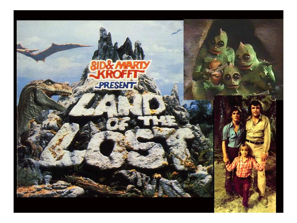
I recall that I drew a lot of dinosaurs. I was a fan and was obviously influenced by watching the hit 70’s TV show “The Land of the Lost”.   
This was the original Land of the Lost. Most people would know the movie that Will Ferrel starred in.
I would also draw a lot of native kalesas (horse-drawn carriages) but would have them equipped with all the comforts of home.  Yes, these were top-of-the-line kalesas with all the nice furniture and appliances that you can find in rich folks homes at that time.  

Kalesa, an oil in canvas painting with a size of 36 x 48 inches. Done by Dante Hipolito*.

*Born in San Andres in 1959. Hipolito is known as a hyper-realist artist.He studied in PWU , 1977-81 . Among his batchmates were hyper-realist Chris Mirang and Carlo Magno. In the mid-80's, he worked as an illustrator at Kalaro publishing doing a magazine for children under editor Lorna Kalaw Tirol. After a short stint as a seaman in Singapore, he went back to work as an artist at Adformatrix Agency, and then at FCB Intl. In 1993, he worked as art director for a Saudi Arabian sdvertising firm, and was active with Pinta Pilipino Art Group.
Our family was never rich so perhaps, looking back, this was my way of fulfilling our needs and was a reflection of my aspirations.  But even then by using the lowly kalesa as my basic structure, I reflected that this is because I was still grounded in reality that we were poor and that we moved houses a lot.  In fact, I can recall six apartment changes when I was growing up.

ELEMENTARY
During my primary years in school, I always get invited to draw for the school. I only know how to use a pencil then so all my drawings were never colored. I remember one drawing of Jose Rizal, the Philippines' national hero, displayed in front of the school during Rizal Day. That was a proud day for me. Below is the exact picture that I copied.  I don't know where my pencil drawing is now.


I also made my own comic book heroes and comic books when I was in sixth grade.  I rented them out for 25 centavos to my school mates. I sold some of them for 5 pesos which was good money already back in 1984.
I don’t know where my comics are now.  Wish I can get some back.
  
HIGH SCHOOL
I submitted artworks (that I never got back) and took the entrance tests for the Philippine High School for the Arts (PHSA).  It was three days of examinations at the Cultural Center of the Philippines
The Cultural Center of the Philippines
The first day we had the standard written exams. The results were released in the afternoon and those that didn’t pass were not entertained the following day.  The second day was another series of written exams plus an interview. Again, many were sent home.  The last day was for the practical tests at UP Diliman.  I thought I was a pretty good illustrator at that time but those with me were light years ahead in skill and talent.  I never received training in any medium and that was my downfall.  I was pretty raw. Only 10 visual arts scholars were accepted out of the hundreds that applied.  I was waitlisted but none of the 10 backed-out of the opportunity.
I instead finished my secondary school at UP Rural High School in Los Baños, Laguna.  Truth be told, I would have not entered any school at that time had it not been for my mother who pushed and helped me with all the requirements.  You see I was so dead set at studying at PHSA that I never bothered to apply to other schools.  I was even feverish while taking the entrance exams at UPRHS. It was good that I passed.

In school and at home, I doodled a lot when I get bored.

Posting part 2 and 3 soon... 

Tuesday, June 14, 2011

The GSIS Art Competition 2011

Its my first year to join the GSIS art competition. Heck I haven't even been painting for a year - just 7 months doing it seriously when I have the time.

The exhibit is located at the GSIS Museum and artists were instructed to claim their pieces on 3 July.
If you are interested to see the exhibit then you have to schedule a visit soon.

During the awards night last 3 June I got to see for the first time all the other artworks. There were more than 400 entries.  If I can remember correctly there were 18, 14 and 4 finalists for Non-representational, Representational and Sculpture categories.

I've learned a lot in that competition and in my own opinion I can summarize it as such.

For the representational category
1. Use 1 subject only - never do a mural type painting with so much going on at different parts of the painting. Overly intricate or detailed paintings don't usually win.
2. Always use realism as a style. Impressionism will also work (such as the winning piece will show you) but employ surrealism as well.

For the non-representational category
1. Don't scrimp on paint. Use lots of it! Use lots of textures.
2. Use a non-traditional color palette and don't over do it. The less colors the better.  A sweet eye-pleasing  abstract would do.  Of course it still boils down to the judge's tastes.
3.  Get a good title. 

Here's a look at some of the pieces. I didn't bother to get the titles and names of each one. Unfortunately I had to use my cell phone to take these pics. I didn't check the batteries of the Nikon D40 camera I brought with me.  Sorry for the bad pics.

Juror's choice.  There seems to be a lot of paintings with children drawing on sand or on the ground. The realism in this painting clinched it for the artist.


Very intricate and laborious painting to make. As  I have observed, paintings like this seldom win. Too bad.  


Abstract. Very simple. Very nice minimalist painting.

Artist Dante Alarcon of Los Baños, Laguna with another Laguna artists painting.

Fantastic corn painting.  Love the details on this one but the subject did not conform with the theme.

Another nice painting.

Laguna artist Emil's painting.

Mang Turing's painting

Nice painting. When I saw this painting, the execution was very good  that I almost felt like that he was using chalk.


Fantastic realism on this one.  Concept was also very good. Wondered why it didn't make the finals.

Nice minimalist painting. The colors in this pic are bad.  Original color is very red.


Some more paintings.

Good concept...a city on a rooster's comb.

Non-representational paintings

Mang Dante's painting.  I felt a visible change in Mang Dante's aura that time when he saw where his painting was located.  I have a beef with those who placed this painting here. Number 1 - Part of it is behind a column. Number 2 - There are ATMs in front of it. Number 3 - There is a movable bulletin board also blocking the way.  In my opinion, each and every artwork should be respected.  Handlers should also be educated not to drag paintings.  Mine was dragged on the floor during the submission. My painting has no frame and with sides painted.

Finalist on the right.  Excellent classical impressionism painting.

Very nice painting.  Notice child-like drawings on the brick wall?

Very intricate painting .

The most intricate I've seen in this competition.  Fantastic skills!

My personal favorite.  The title is also a winner "Punong puno ng Pag-asa". This is pop surrealism so it didn't make the cut. Will there be a day for this style?

Excellent skill!

Some more top abstracts.
2nd Place - Aris Bagtas (left) and Dante Palmes' Virtual Zone - Juror's Choice. Pic lifted from Dante Palmes' fb album. Dante has 2 entries - both finalists and 1 made it as a Juror's Choice. Congrats Dante!

Laguna artist Dante Palmes' painting. Finalist!
Grand Winner and P240k richer. Deserving to win it!

Laguna artist Lito Ballaran's painting. When I saw this I knew it would be up there competing for the top prize. Nice concept and execution.  Finalist.

My personal choice to win it. Without the tower on his head, it would be better in my opinion. Juror's choice.

Incredible painting. Sort of like Manansala in curvism instead of cubism.  Juror's Choice I believe. But the mural concept doesn't really bode well with the judges.

Education concept for a better future.  I guessed that this was the default of many and was also the judges slant. Juror's choice.  I decided to stay away from education as my theme. Not that I think that it mattered at all.


2nd place - Representational.  Education concept = winner!

Fantastic astronaut in the background.  This guy has been painting bubbles shaped-like letters for a long time. 

Aside from the skill look at the reflection and you'll see why this was a finalist.

Sam Occeno's (guy in white) painting along with the top abstracts.

Finalist - nice strokes.

Very simple concept - Finalist.

A personal favorite. One of the top abstracts I believe. 

Children drawing on sand - a favorite concept. 

Look at the cursor pulling one of the strings. Juror's choice.


My painting covered by a railing and with the light at the back hence the painting was dark.  I didn't think I'll win anything but as I mentioned every painting deserves respect. Each one should be treated as the winner.
Congratulations to all the winners! When I say winners I mean the organizers and all the artists who joined.